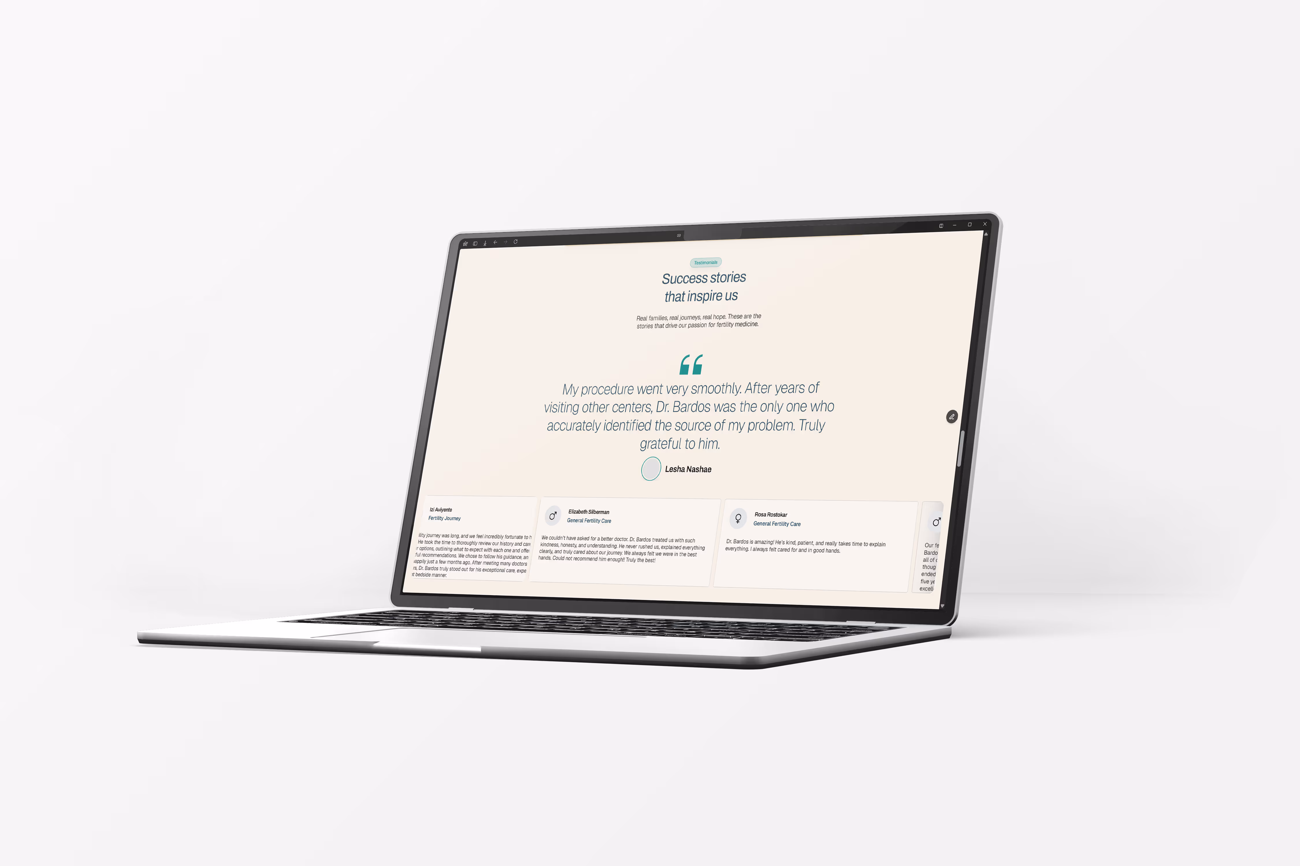
white glove fertility
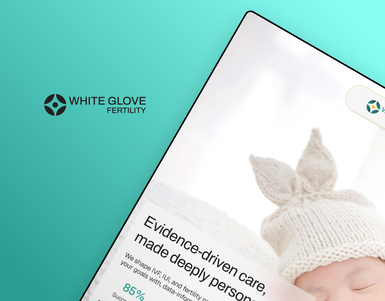
White Glove Fertility is a concierge fertility service offering personalised, high-touch support throughout a deeply personal and emotional journey. The organisation required a complete brand and digital foundation that would communicate trust, discretion, and compassion while positioning itself as a premium service provider. The goal was to create a cohesive identity and website experience that reflected sensitivity, clarity, and professionalism across every touchpoint.
Designing within the fertility space required careful consideration of emotional context and medical complexity. The brand needed to feel reassuring without appearing overly clinical, and premium without feeling distant. Communicating detailed services clearly while maintaining warmth and empathy was central to the challenge. Establishing credibility, guiding users through sensitive information, and ensuring consistency across brand, print, and digital assets required a strategic and restrained design approach.
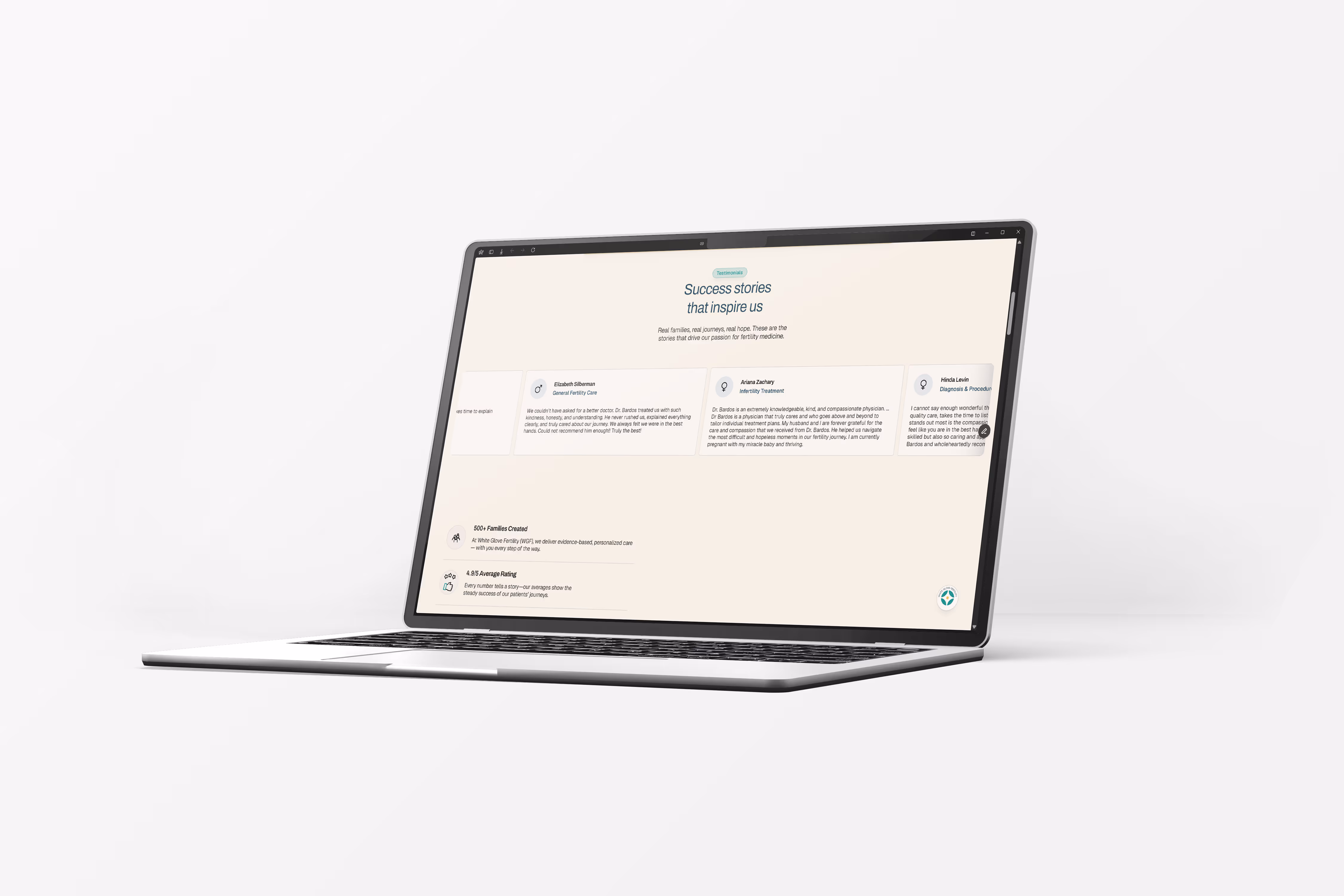
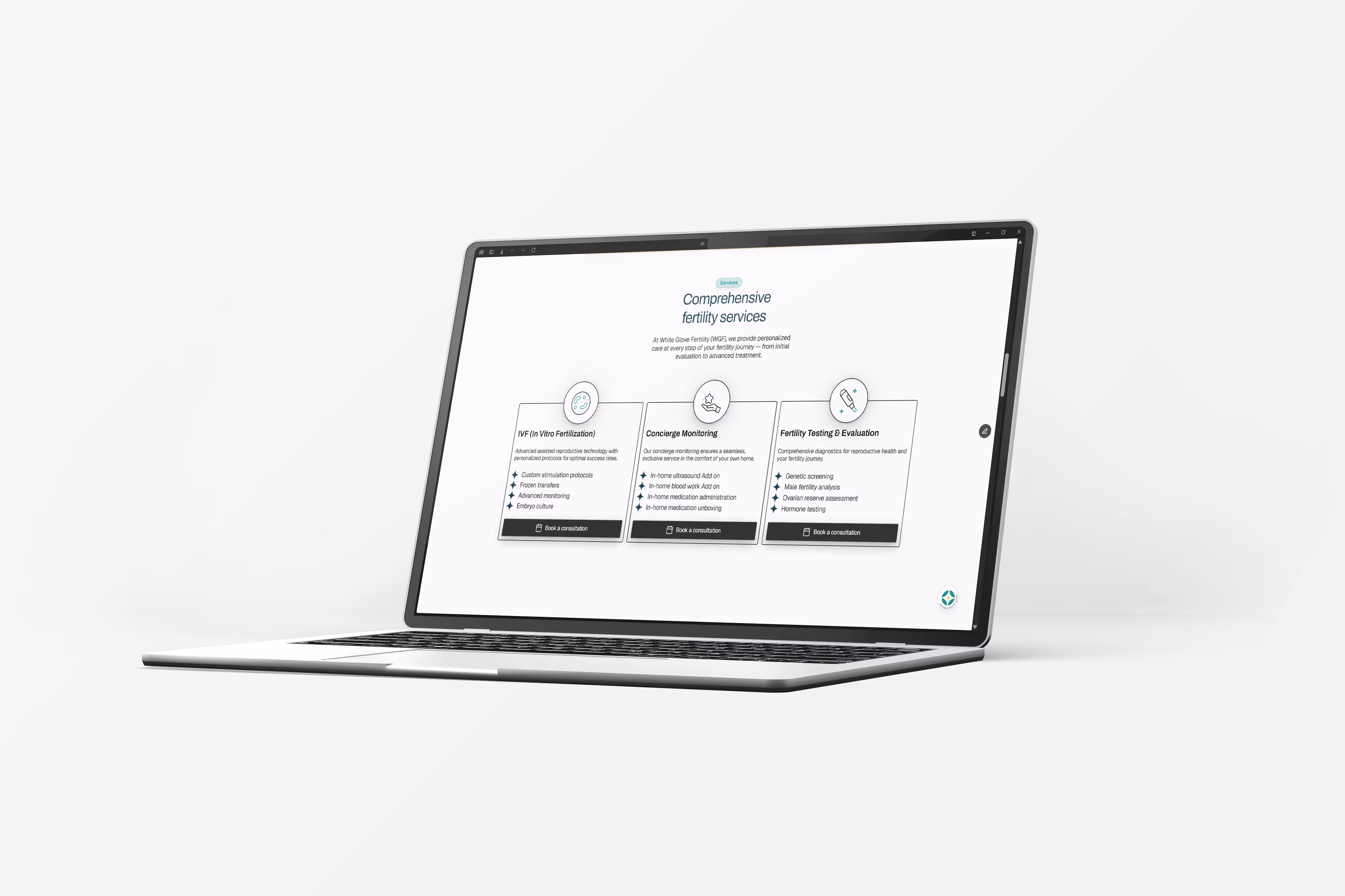
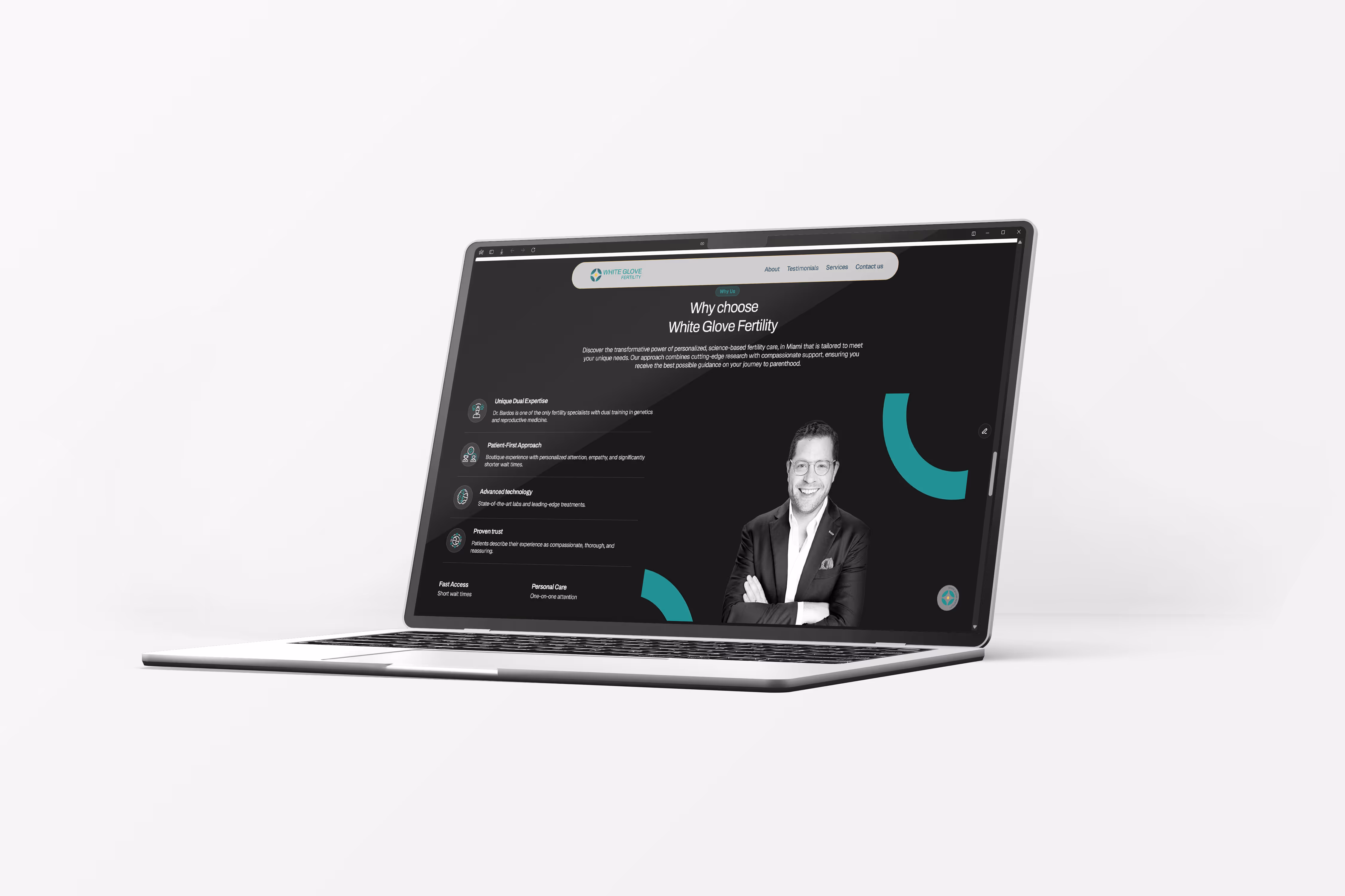
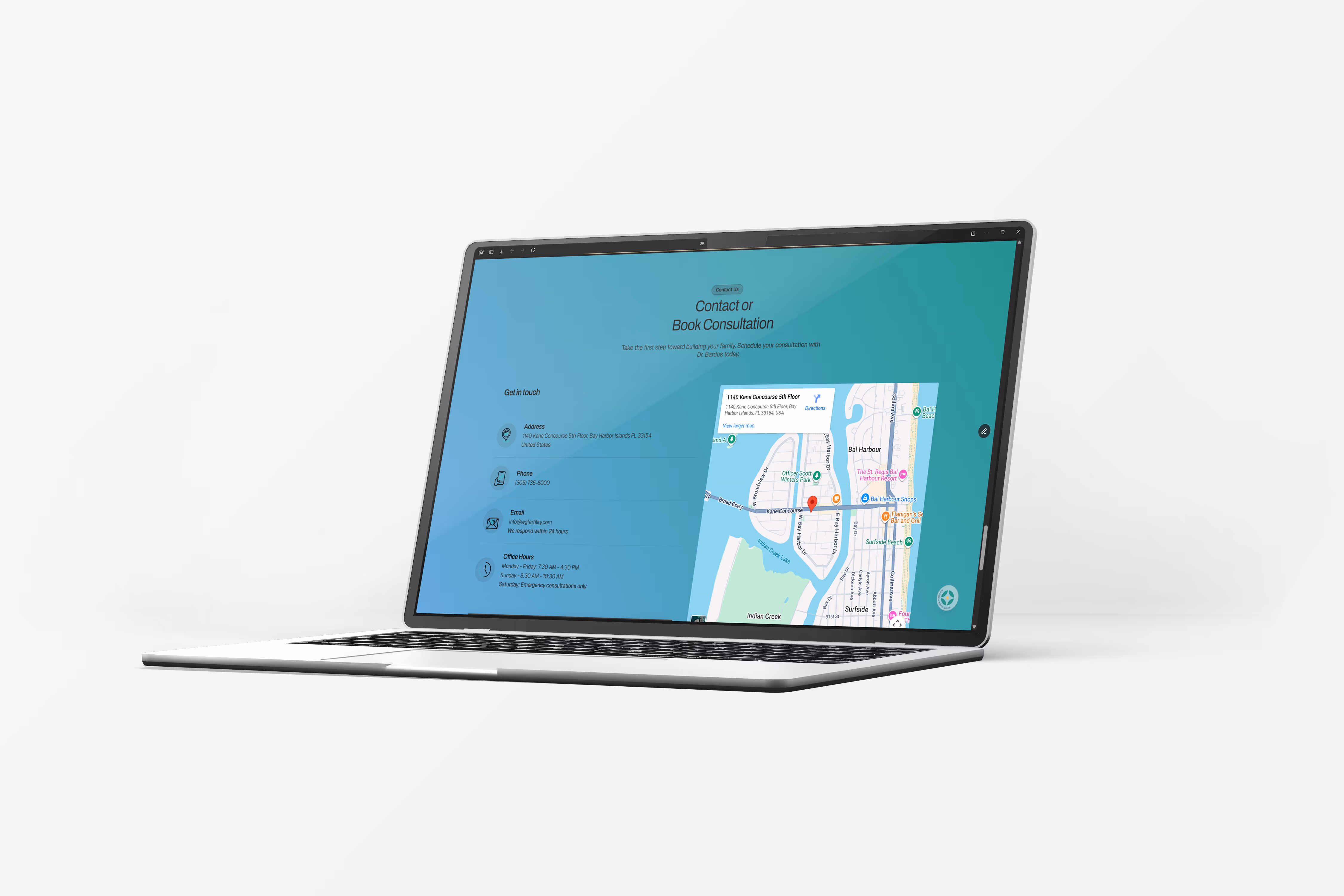
I began by defining the core brand foundations, including logo design, colour palette, typography system, and tone of voice guidelines to ensure clarity and cohesion from the outset. The website experience was structured around progressive information flow, generous whitespace, and clear content hierarchy to reduce overwhelm and build trust. Every visual and content decision was aligned with the brand’s promise of personalised care, creating a seamless system that extended from digital to physical touchpoints.
The result was a unified brand and digital presence that communicates empathy, professionalism, and premium service. The structured website experience improved clarity around offerings while strengthening brand credibility. With cohesive guidelines and a scalable foundation in place, White Glove Fertility now has a consistent identity system that supports growth and reinforces trust at every interaction.
.avif)