Case study
reach tracking systems
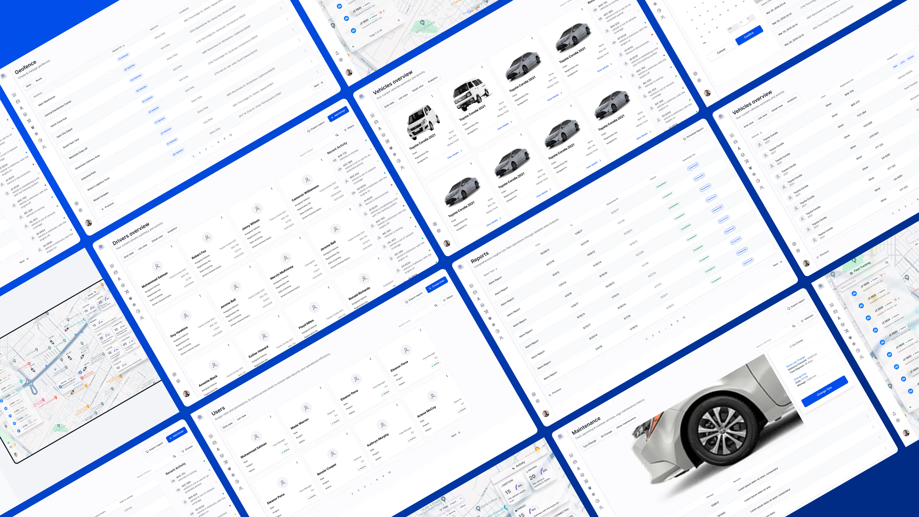
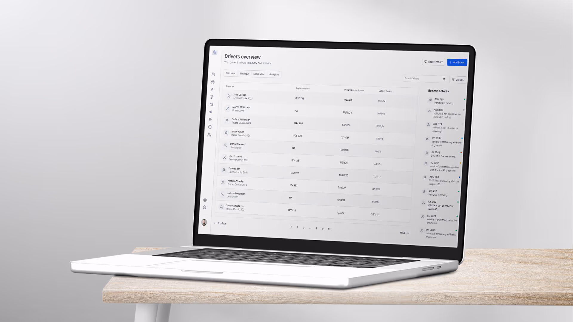
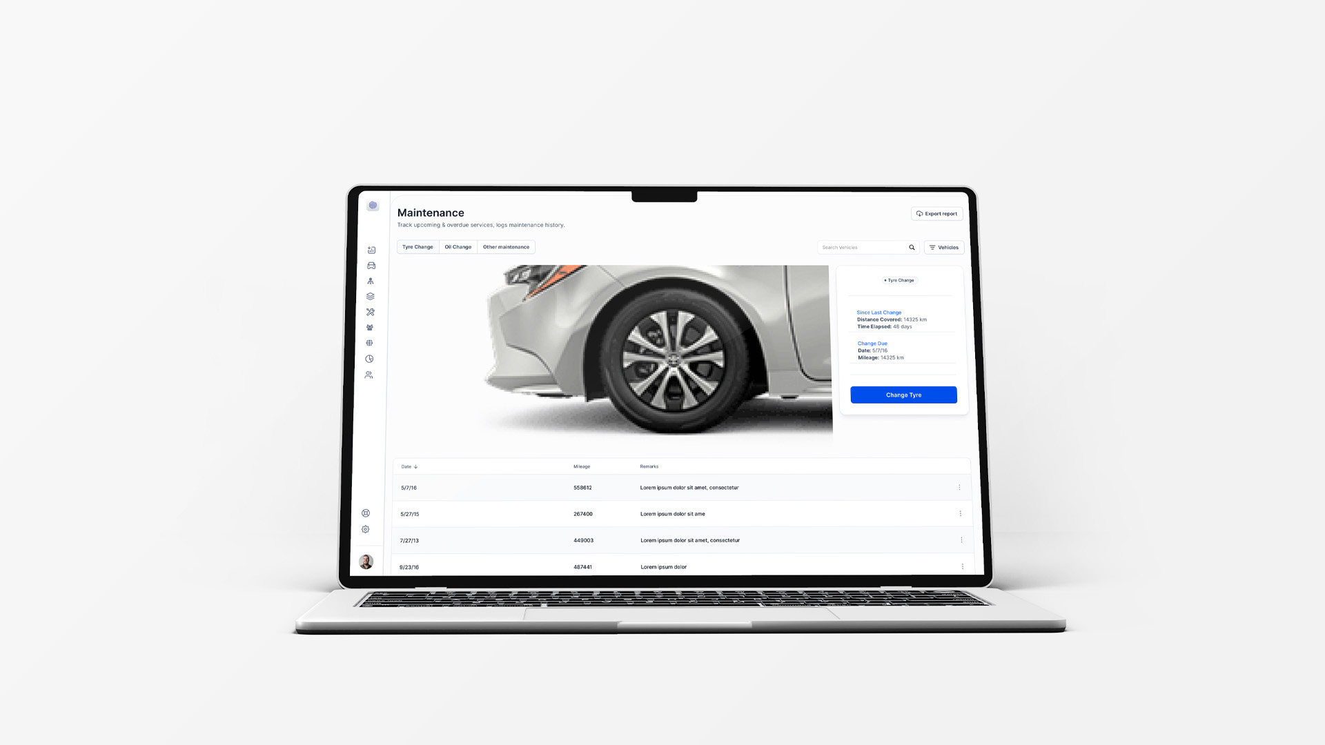
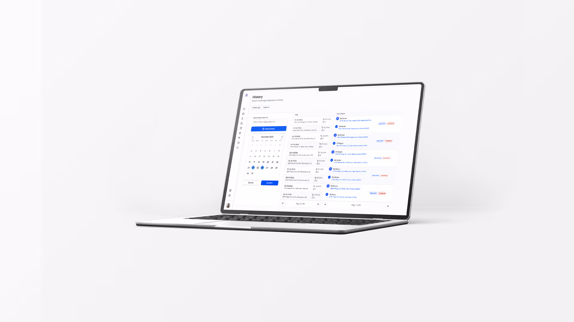
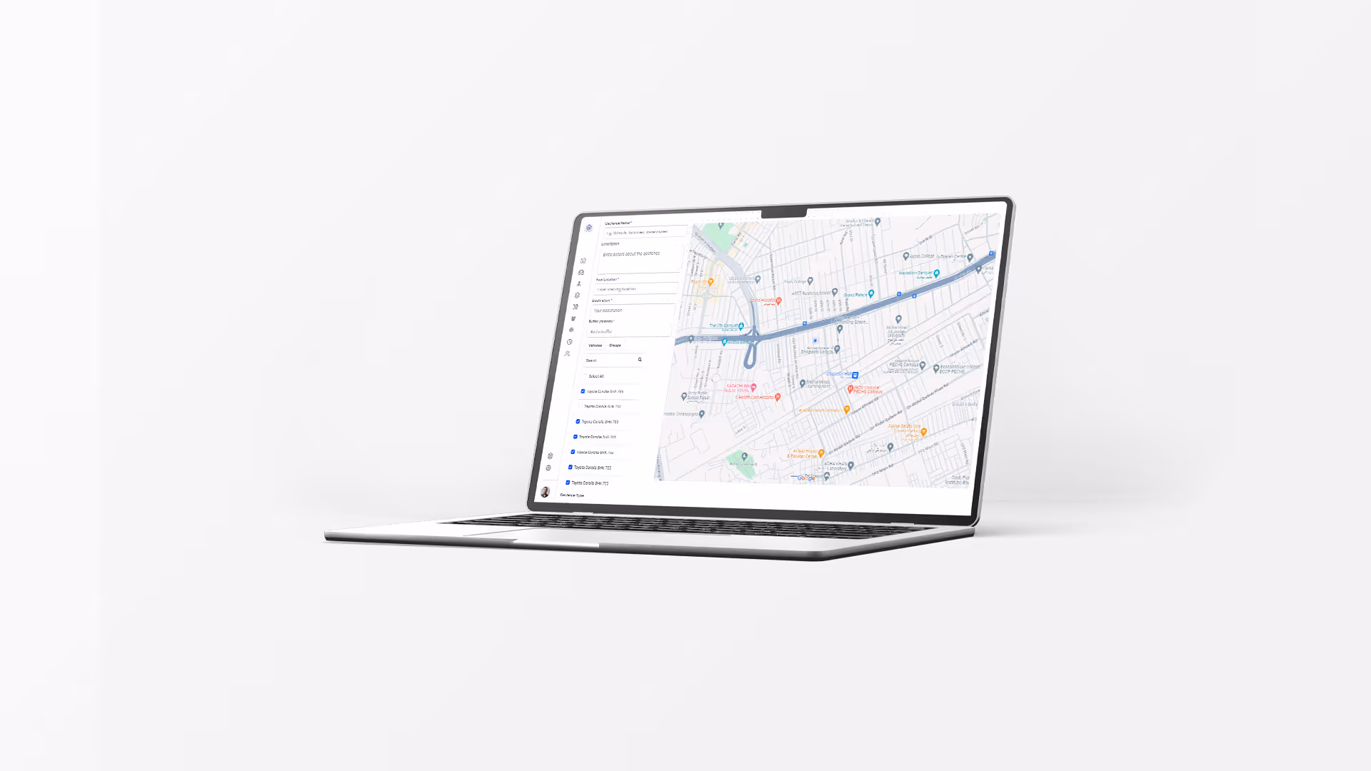
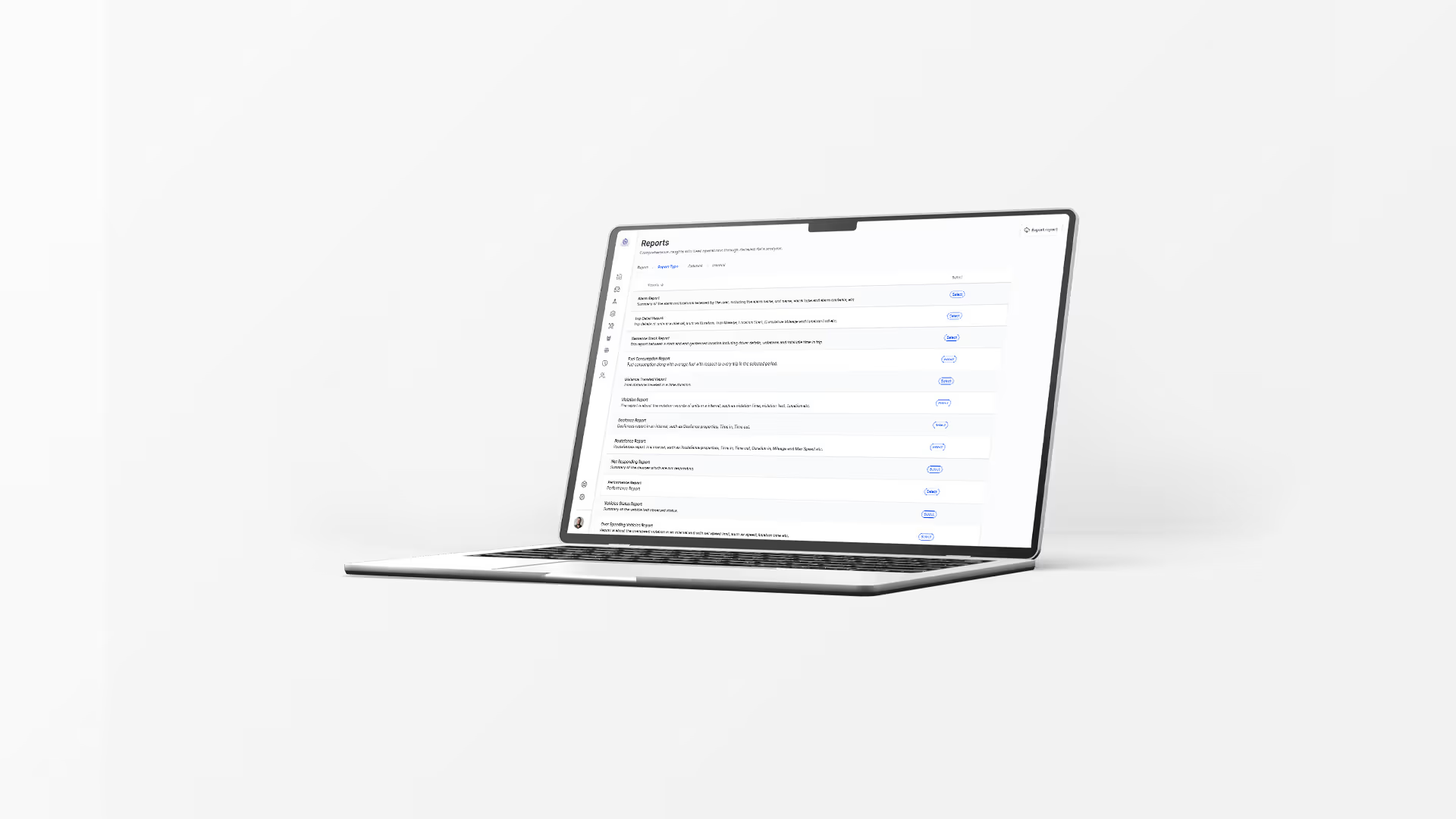
Reach Tracking Systems required a modern dashboard experience to manage and interpret operational data efficiently. The objective was to design a digital interface that transformed complex tracking information into a structured, easy-to-navigate system. The platform needed to support fast decision-making while maintaining clarity, consistency, and scalability across the product.
Data-heavy platforms often overwhelm users with dense information and unclear hierarchy. The key challenge was to organise large volumes of tracking data into a digestible format without sacrificing functionality. The interface needed to prioritise visibility, reduce friction in navigation, and allow users to quickly identify trends, metrics, and key performance indicators without cognitive overload.
I began by mapping user workflows and identifying the most critical data points for daily decision-making. The information architecture was restructured around priority metrics, using clear hierarchy and modular components to organise content logically. Wireframes focused on usability and efficiency, while the final visual system emphasised legibility, spacing, and consistency. The dashboard was built as a scalable system, ensuring flexibility for future feature expansion.
The result was a streamlined dashboard experience that improved data visibility and usability. Key metrics became easier to interpret, navigation was simplified, and the overall interface reduced cognitive strain for users managing operational workflows. The project reinforced the importance of hierarchy, modular systems, and clarity when designing complex, data-driven products.